About Unlisted Magazine
In a city where moments happen and disappear overnight, this magazine exists to notice what might otherwise be overlooked or left undocumented. It documents the stories of visual artists, performers, event organizers, and the audiences who shape and sustain the creative community. It highlights venues, pop-ups, and opportunities, sharing information openly so artists can connect and grow. This is a space that celebrates people creating without waiting for permission or recognition.

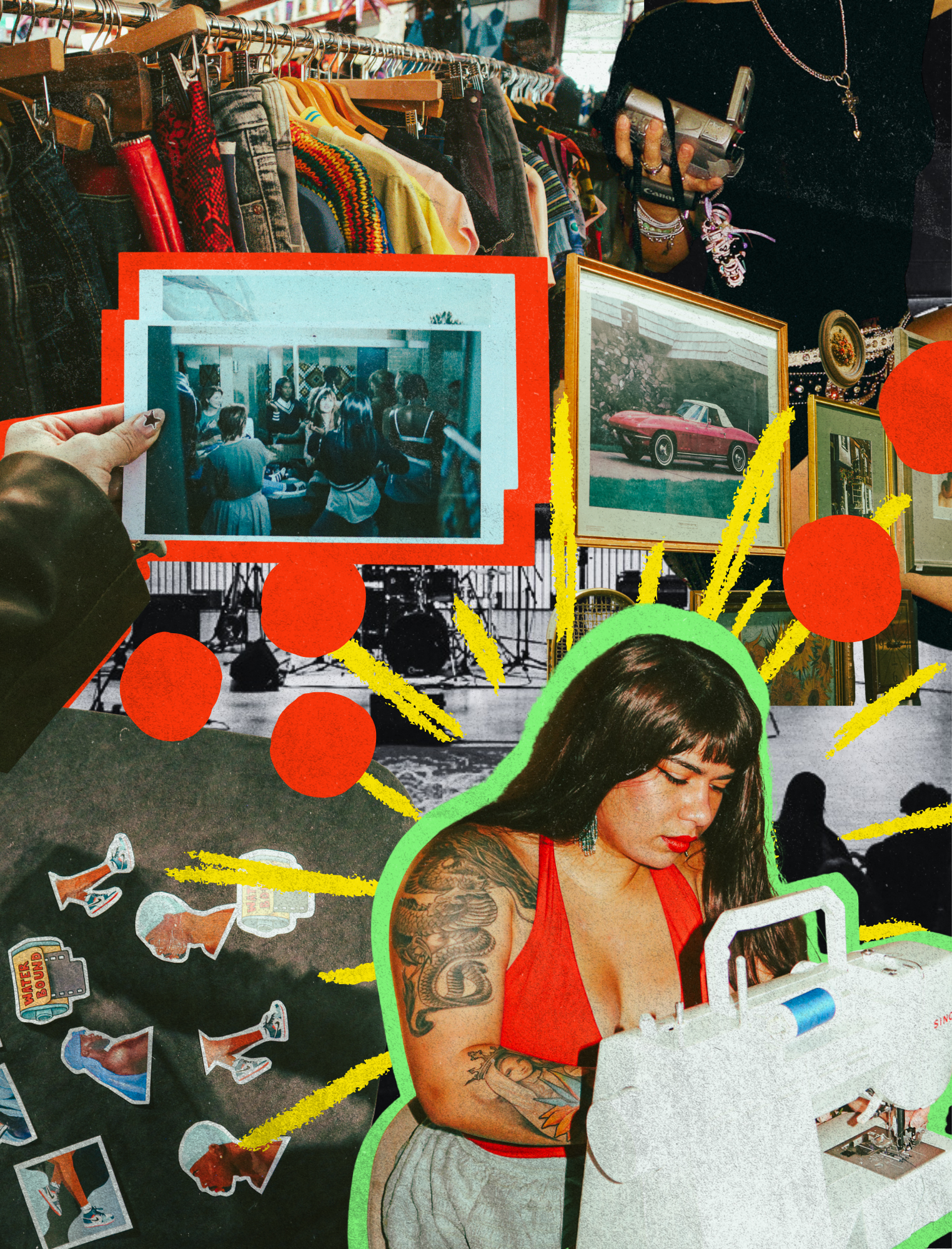
Collage spreads from inside the magazine
About the Cover
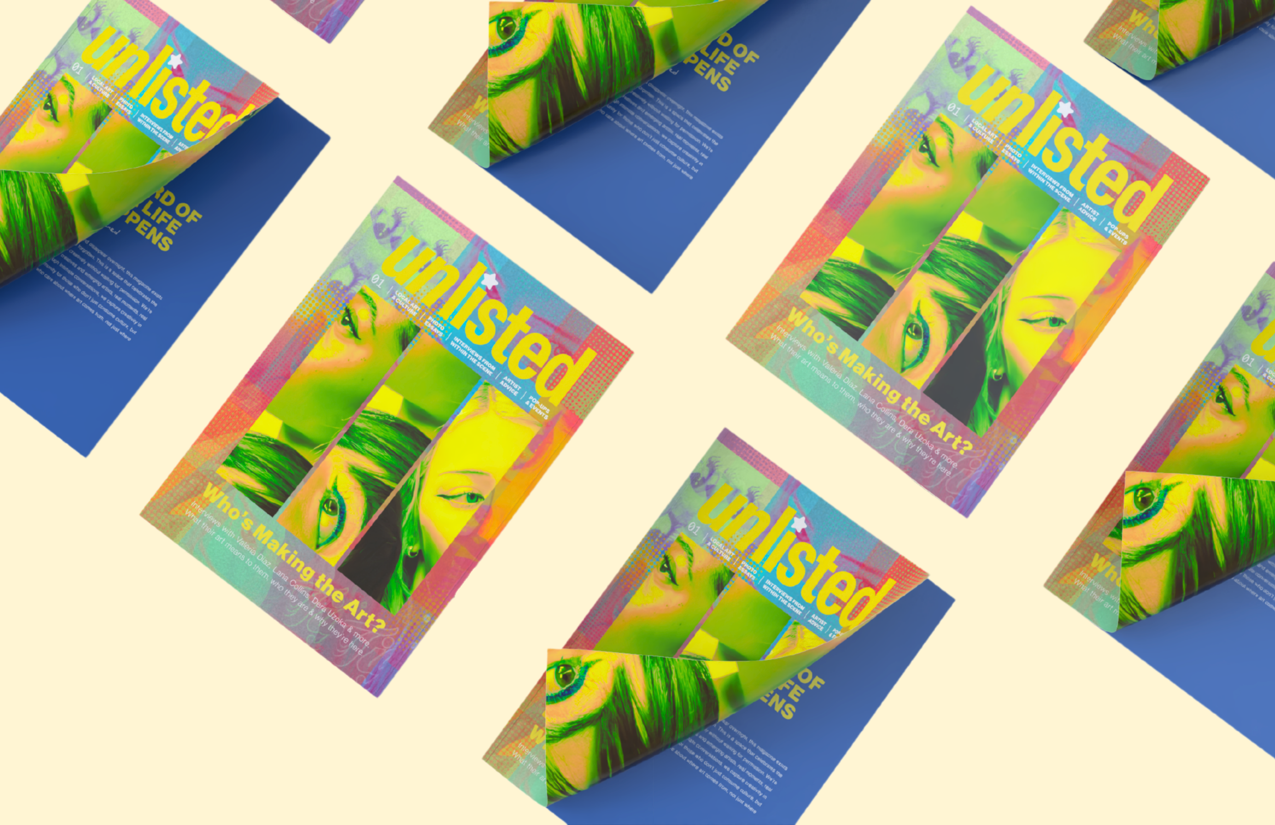
I wanted the cover to feel intimate, and slightly disorienting in a way that reflects the title of the feature article: ‘You Take a Piece of My Heart With Your Gaze.’ That title is really about the emotional weight of being seen, and how being looked at, understood, desired, remembered, or interpreted by others can feel both beautiful and vulnerable. The feature is all about identity and how it influences art and the way identity can be shaped through observation. So visually, I wanted the cover to feel like it was built around fragments of a person rather than one complete, polished portrait. That’s why I used repeated crops of eyes, faces, and partial features layered across the cover. I wanted it to feel like a collage of the three artists’ identities who are a part of the feature article.
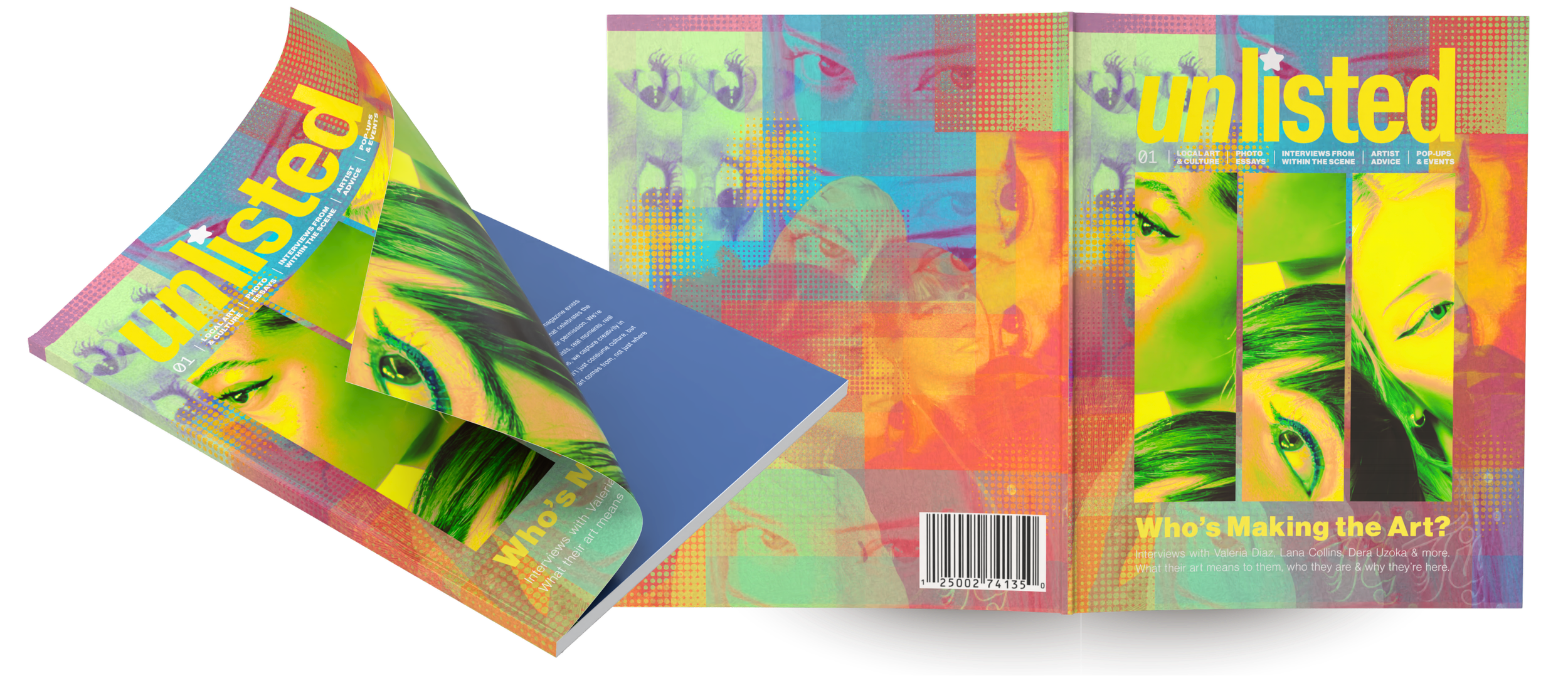
Cover - Issue 01
About the Departments
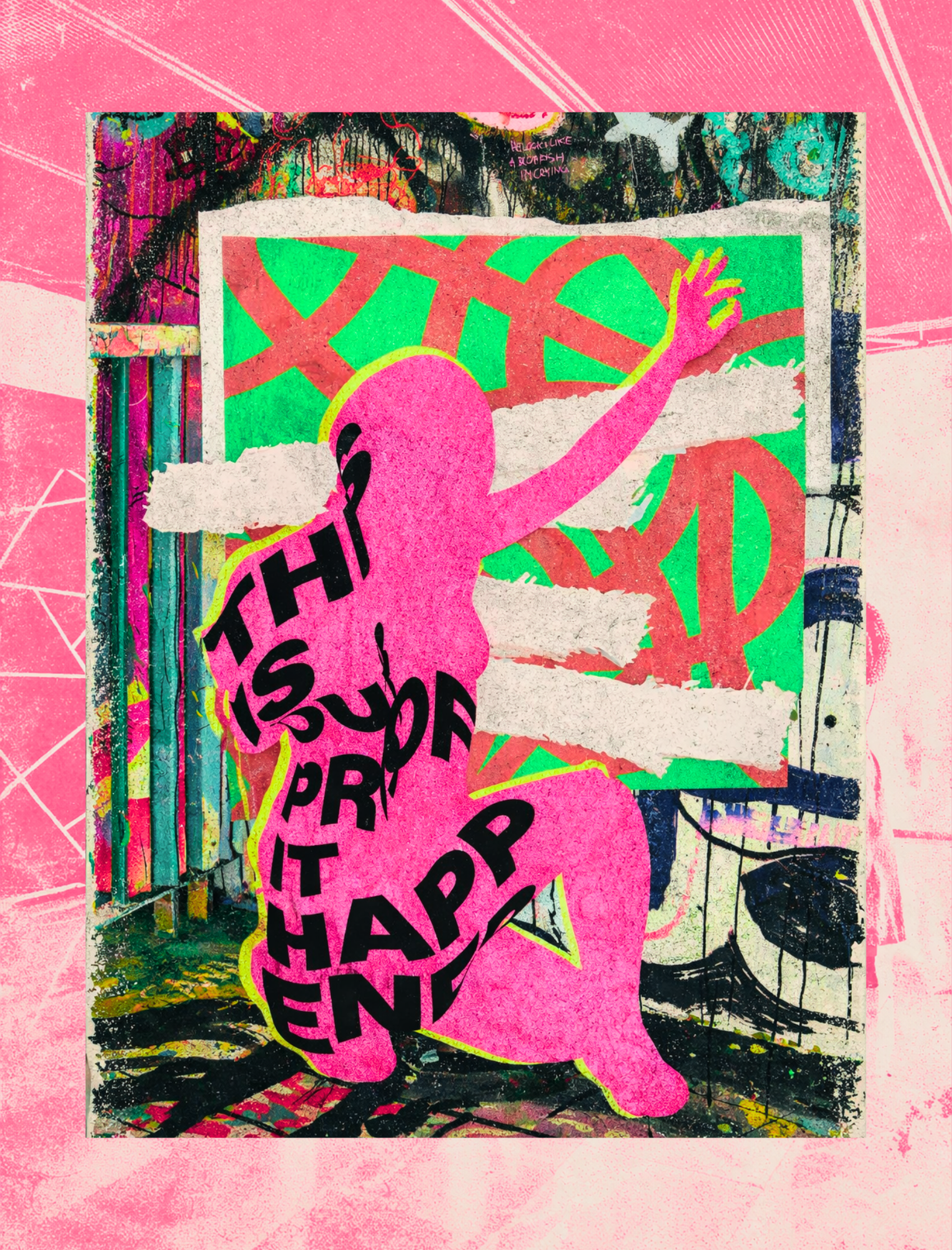
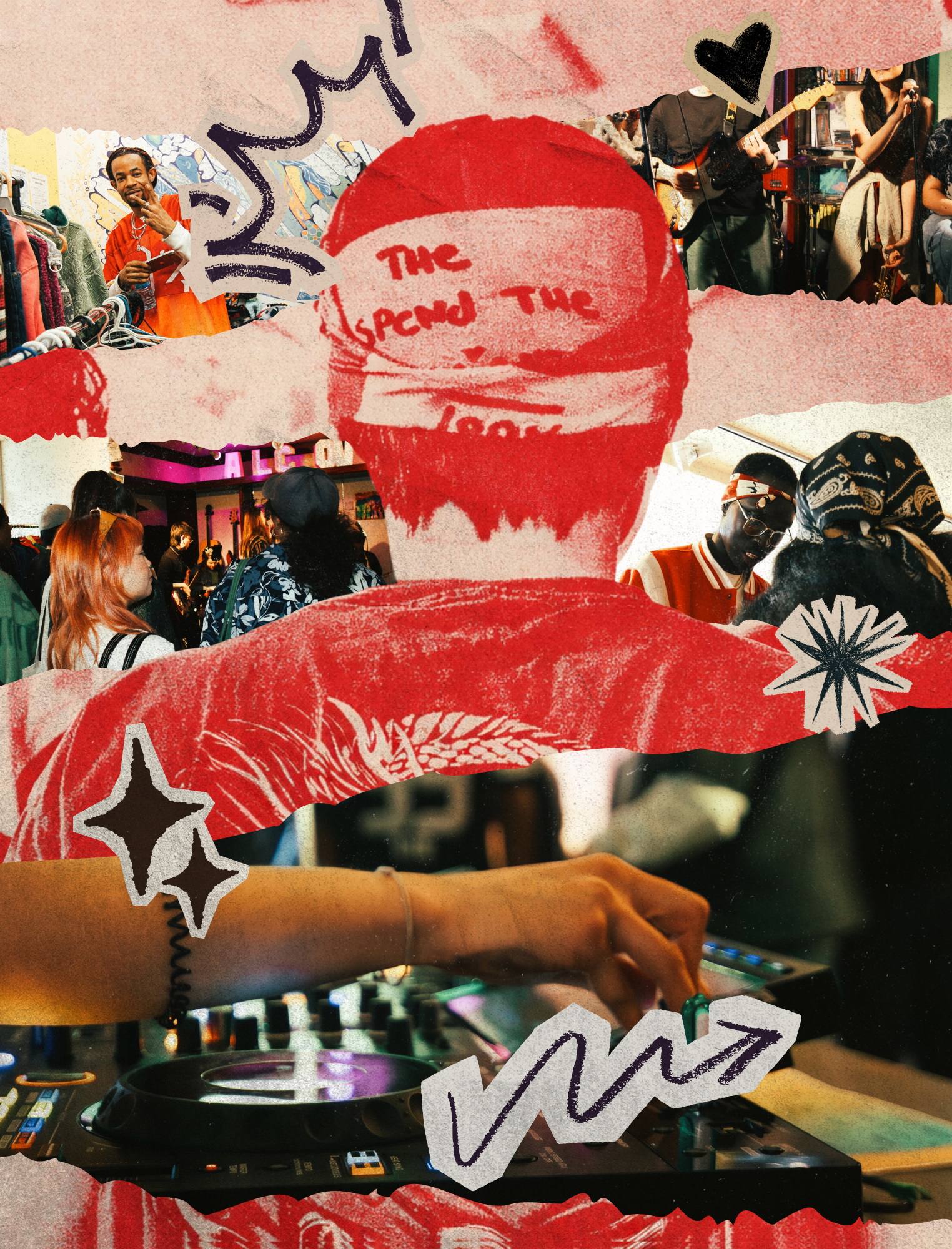
One of the biggest goals for the interior spreads was making sure that each section felt like its own little world. I didn’t want the magazine to feel repetitive or overly templated, because the creative community itself doesn’t feel like that. Every artist, event, and story has its own energy, so I wanted the design system to be flexible enough to reflect that. I wanted each spread to feel like stepping into a different corner of the community. For example, with the Luki Charms spread, I leaned into brighter, playful colour and a more energetic layout because the brand itself feels youthful, nostalgic, and personality-driven.
Some spreads are more image-heavy, some are more text-led, and some are built around contrast and negative space. I wanted the reading experience to feel dynamic and alive. It was important to me that the magazine never felt flat or predictable. I wanted readers to feel like every turn of the page offered a slightly new experience.
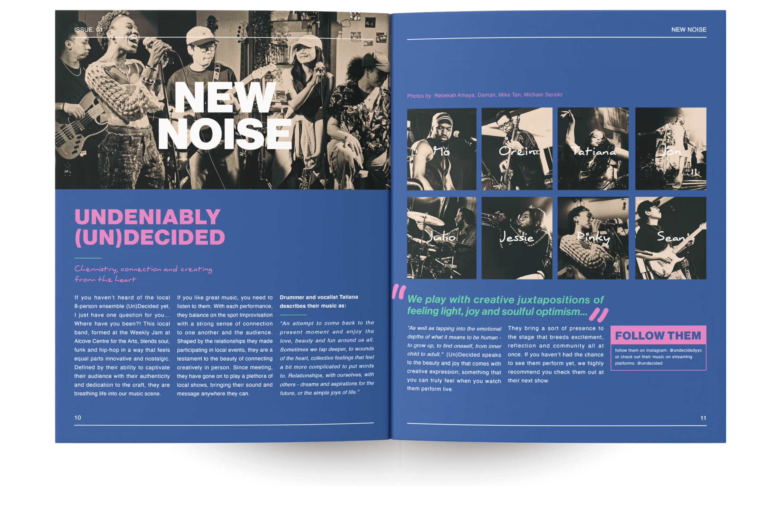
Department - New Noise
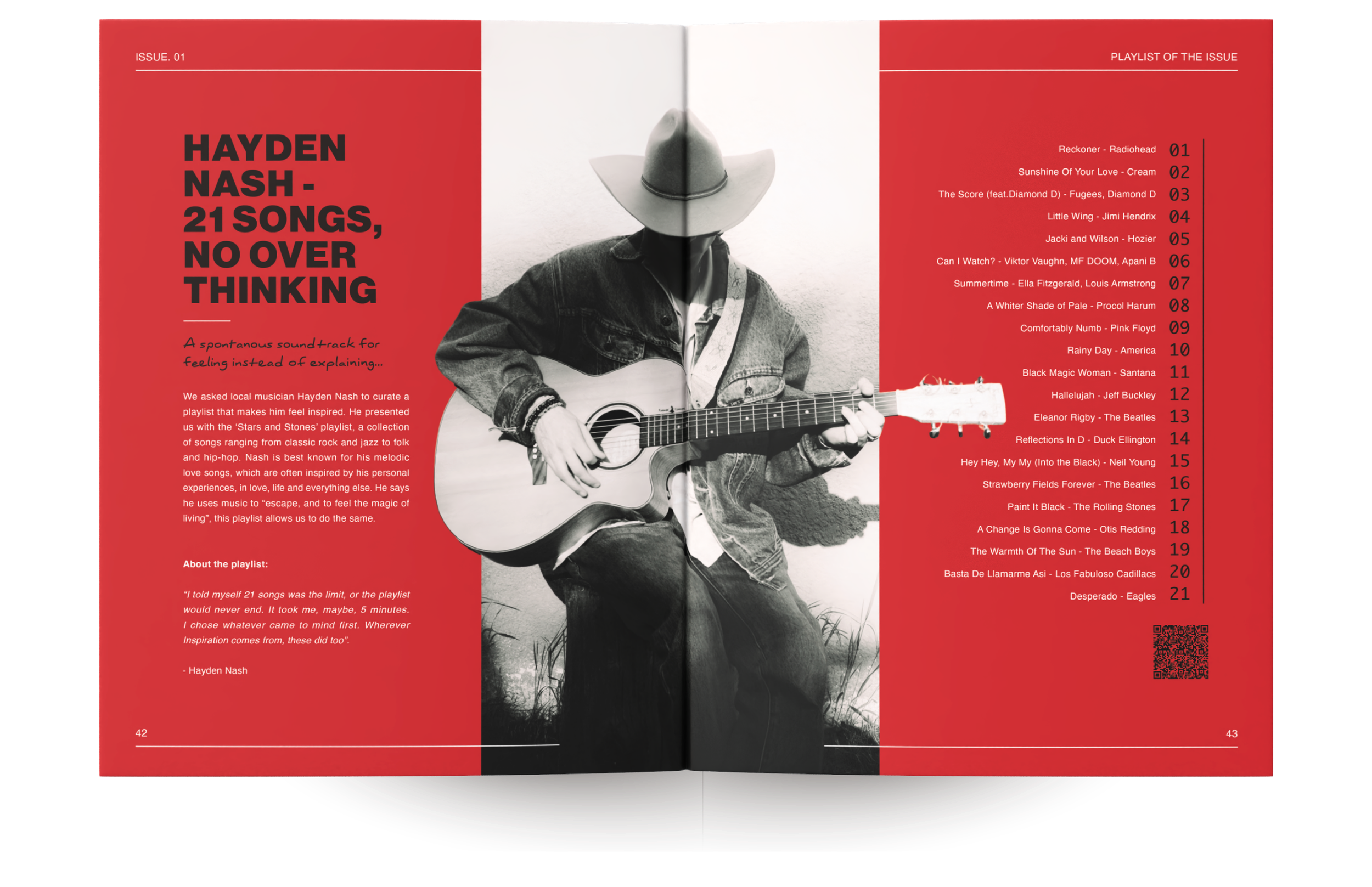
Department - Playlist of the Issue
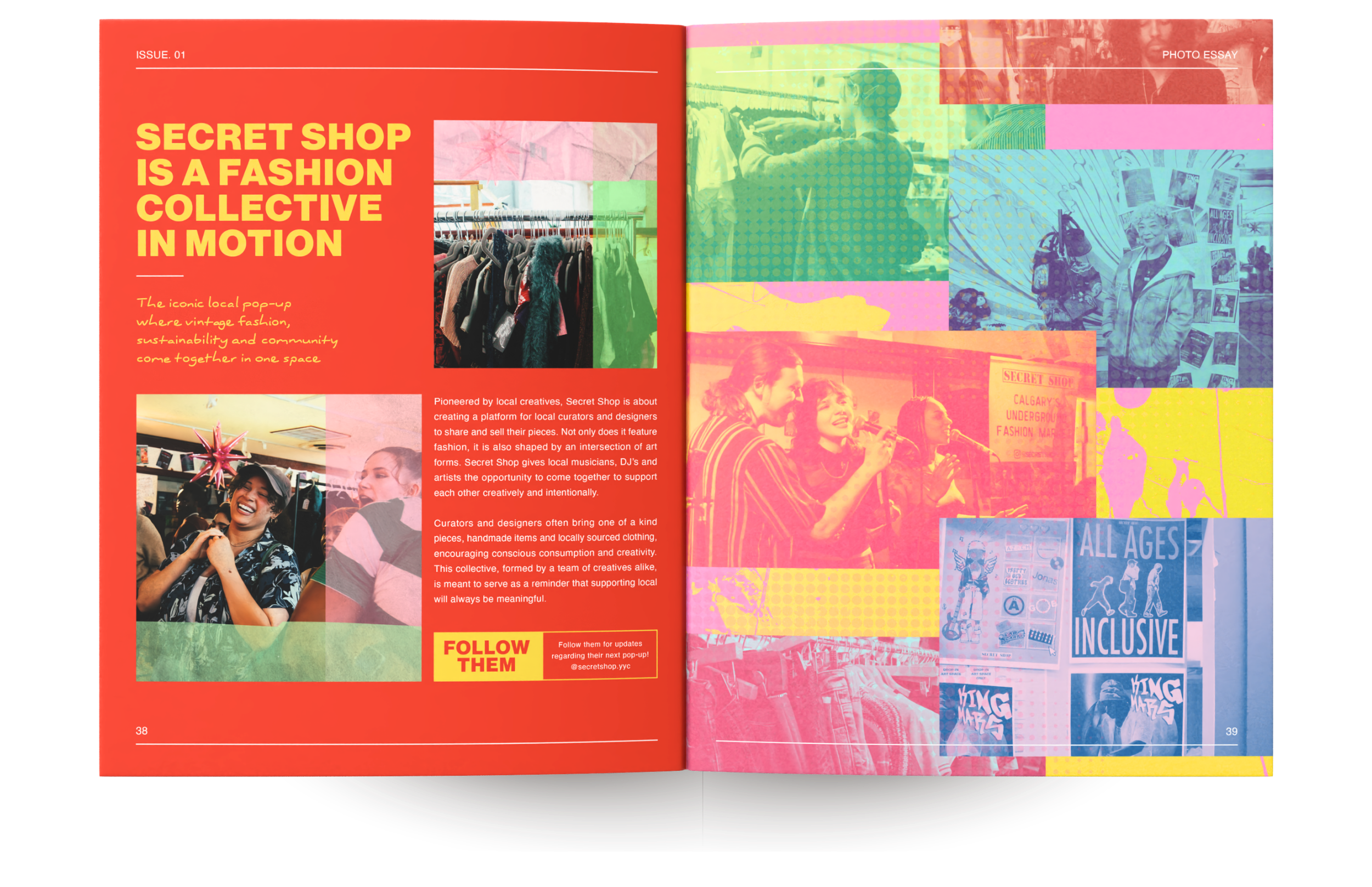
Department - Local Photo Essay
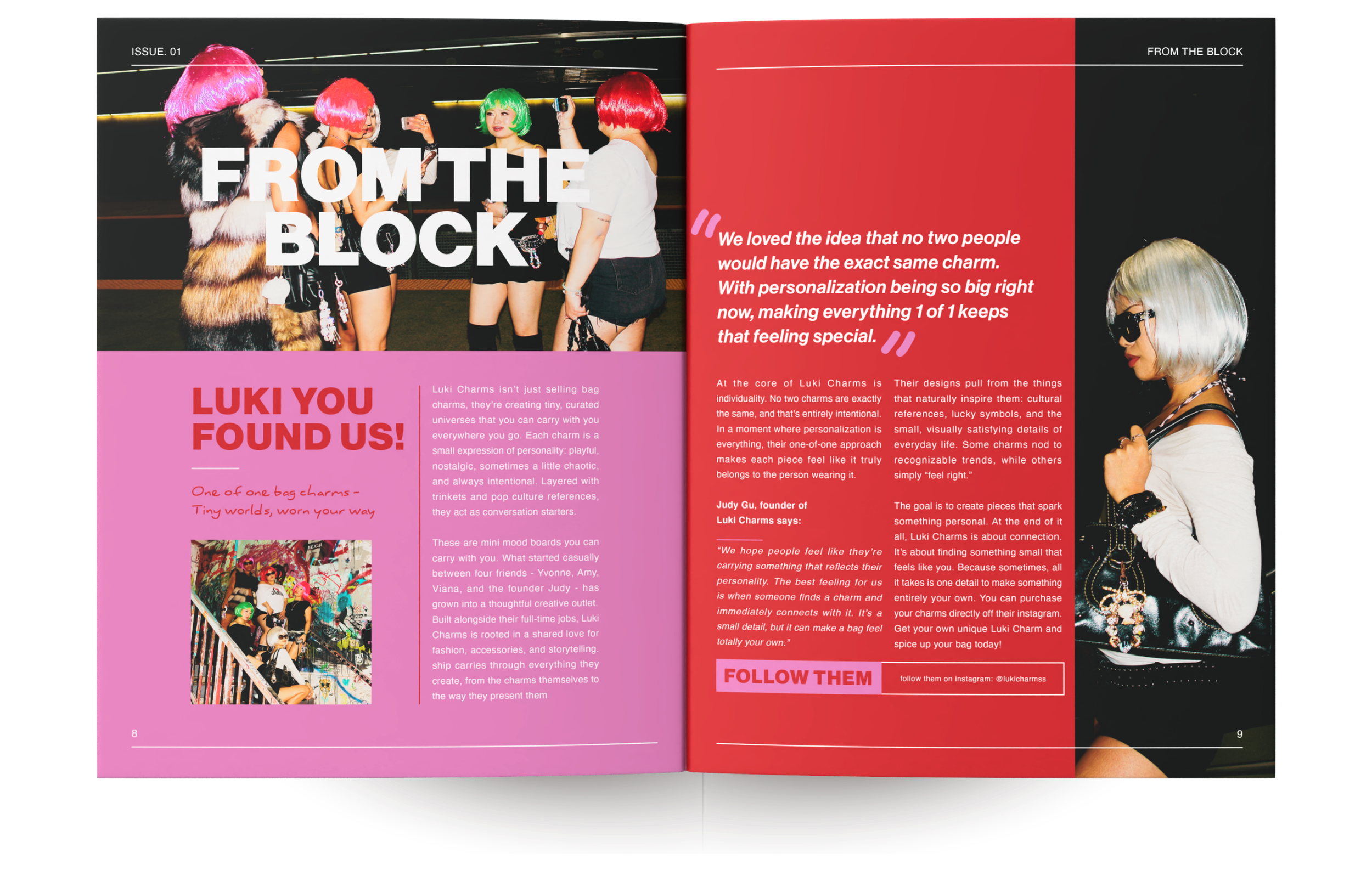
Department - From the Block
About the Feature Article
The feature article focuses on three female artists: Valeria Diaz, Lana Collins, and Dera Uzoka. It explores the ways they use their work to navigate identity, femininity, vulnerability, and self-expression. For this section, I wanted to visually shift the tone slightly so that the artists themselves became the primary focus. In the individual artist spreads, I used colour to help distinguish each person while still keeping them within the same feature system. I used larger portrait-led layouts so that the reader could really sit with each artist and gave their portraits more visual weight. I also wanted this section to feel a little more intimate and reflective than some of the faster- paced departments. All three of these artists use a lot of reds and blues in their work, which was something I noticed while working on the articles, so I wanted the colours in my design to reflect that as well.
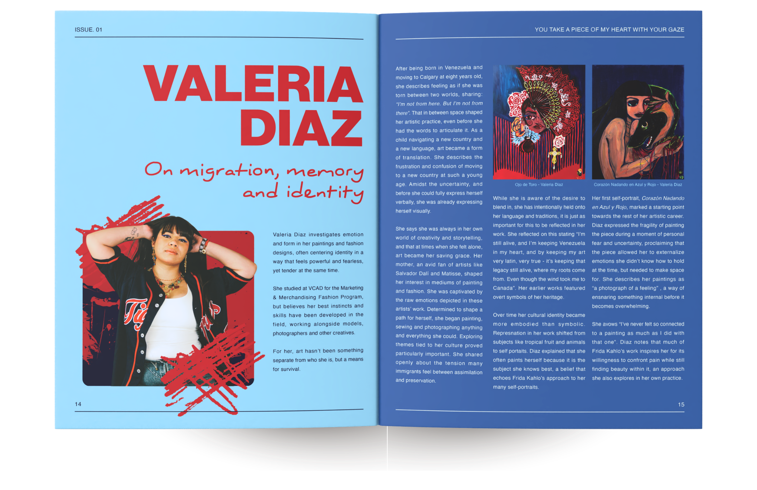
Feature - Valeria Diaz
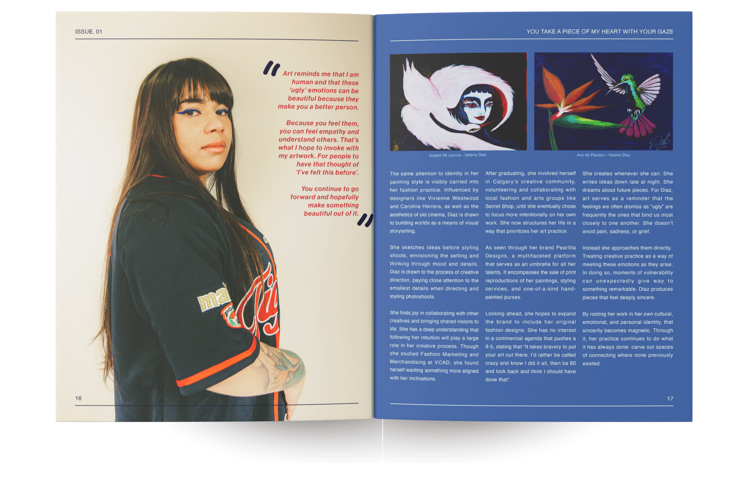
Feature - Valeria Diaz
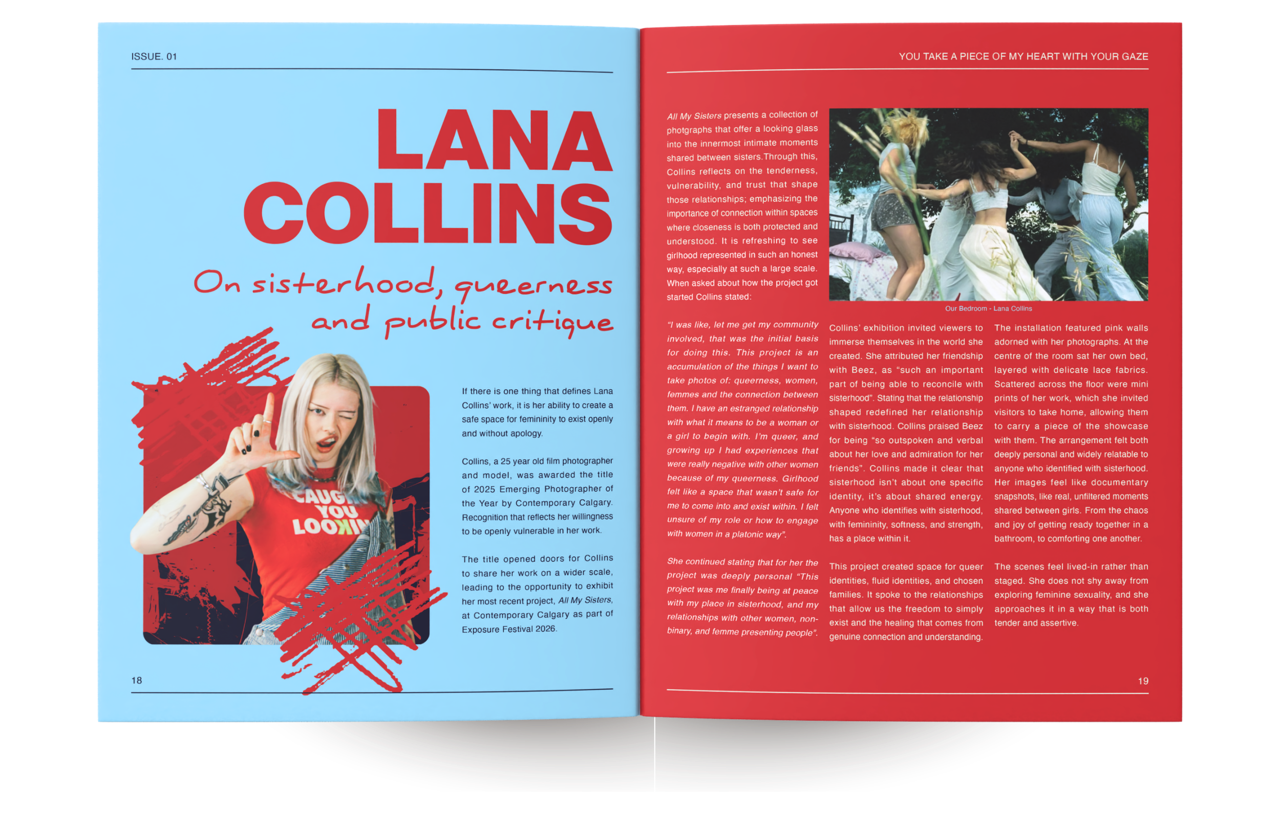
Feature - Lana Collins
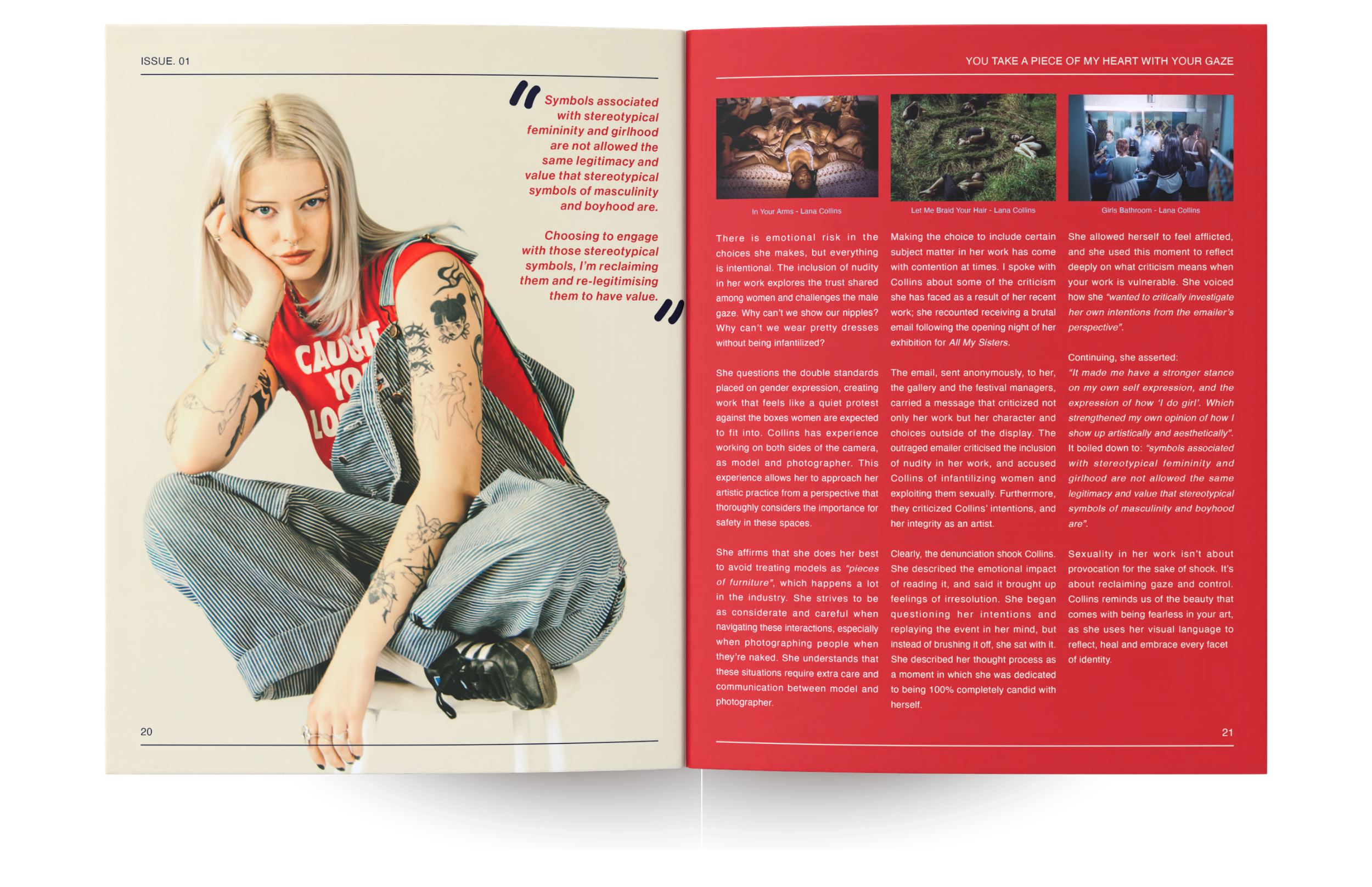
Feature - Lana Collins
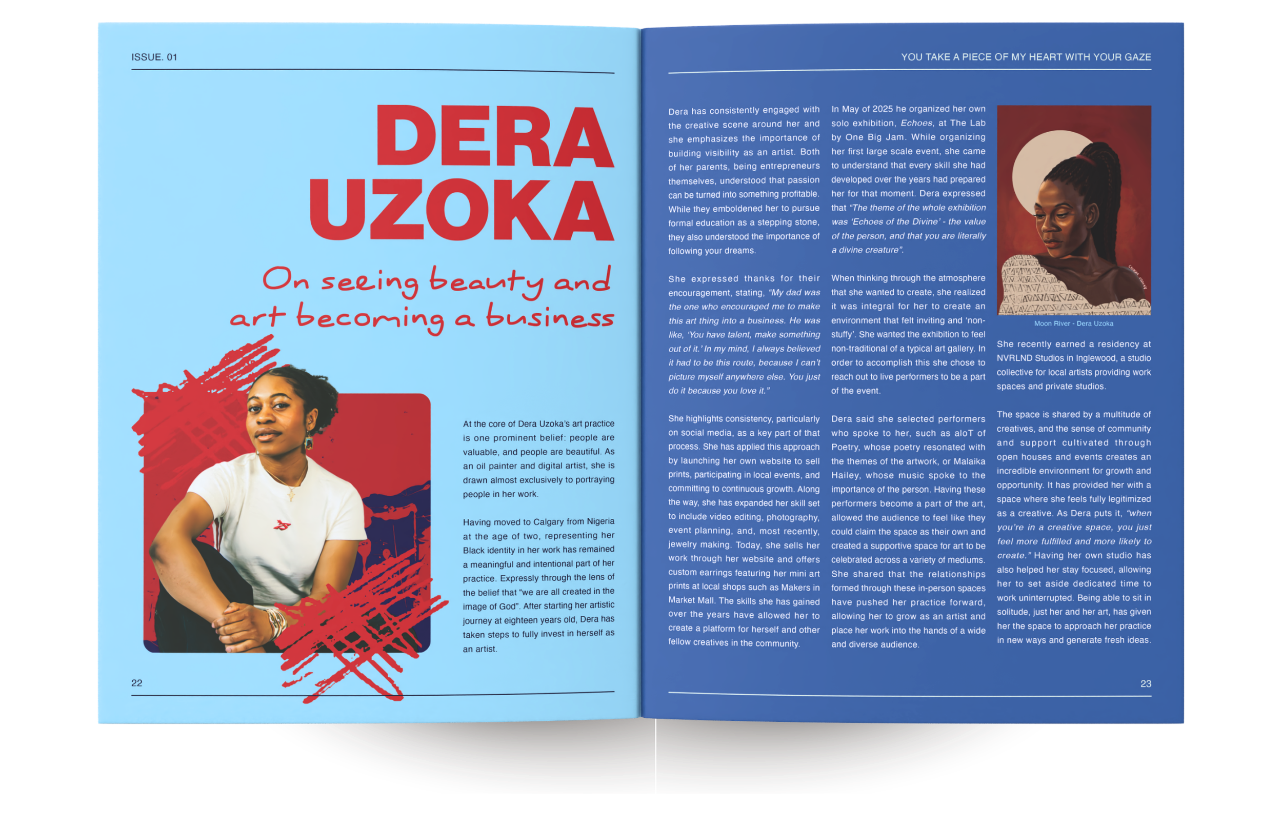
Feature - Dera Uzoka
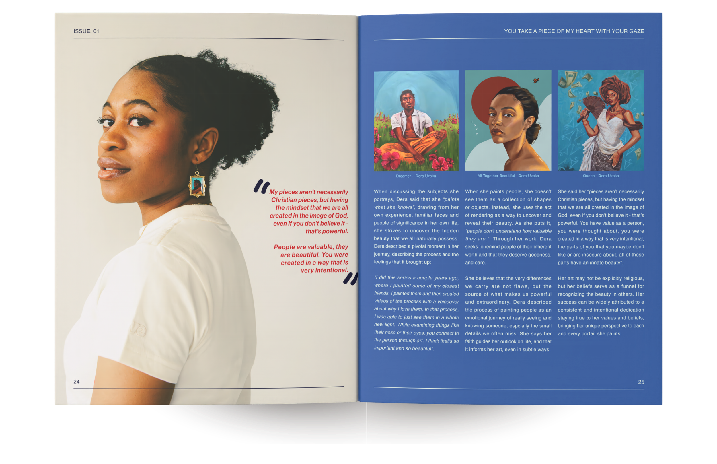
Feature - Dera Uzoka